My Role
UX Design, Usability Testing, Wireframing, Prototyping
Type
Academic Project
Team
Loren Berry (UX Research), Anhua Wu (UX Design), Boyan Wu (Documentation)
Timeline
Oct 2023 - Dec 2023
Backstory
As a part of one of my core classes at the University of Michigan, ‘SI 582: Introduction to Interaction Design’, students were divided into teams of 4 and tasked to work with a given theme and come up with a problem statement based on our research.
As my group was assigned the theme of “Time Management” we conducted research by exploring online blogs and databases to identify the demographic facing the most challenges in managing their time. We found that individuals with jobs allowing them to set their own schedules, such as freelancers and those with predominantly online roles, as well as students, are the primary groups struggling with time management. Following this research session, we identified our target stakeholders as:
- Remote workers
- Freelancers
- Content creators
- Stay-at-home mothers
- Students
Problem Statement
People who primarily work from home face challenges for them to manage their time effectively. The struggle with time management is caused by distractions within the home and the consistent need to multitask, which effects overall productivity.
Solution
The final product “Timecraft”, is an amalgamation of solutions for the problems that we identified through user interviews.
A simple and efficient way to create tasks and events
Pomodoro timer to time tasks and a website blocker for distraction-free productivity
Analytics to see where you spend your time, and AI-generated tips to improve your time management
Here’s a link to the prototype.
User Personas
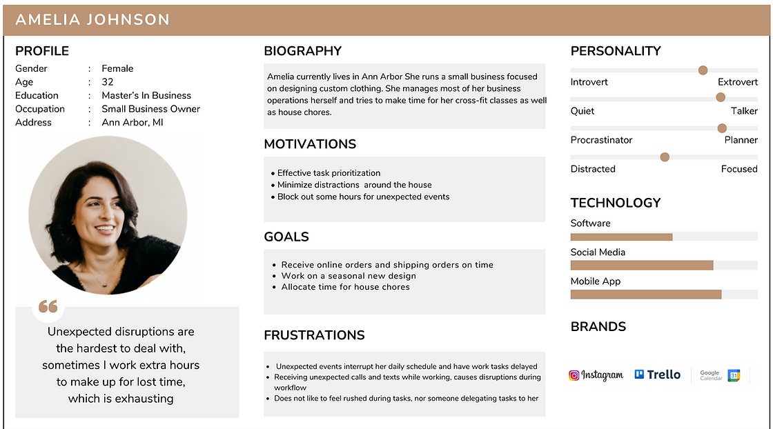
Following the 8 user interviews that we conducted with our target stakeholders, we crafted two primary user personas by synthesizing key insights encompassing their motivations, needs, frustrations, and the tools commonly employed by our interviewees in their time management practices.
Information Architecture
The solution consists of 3 main features that are
My Schedule
Productivity
Task Analysis
The schedule serves as the home page and allows easy access to the other pages via a global navigation bar.
User Flows
Productivity Tools
My Schedule
Usability Tests
The research protocol was designed to enhance task and time management for users. It involved direct observations and think-aloud methods during one-on-one user-tester interactions, moderated by a student. These sessions were conducted either in-person or remotely via Zoom.
The usability test script aimed at identifying user experience issues, specifically focusing on the application's features such as task/event addition, timer, focus mode, web blocking, and a tips function for task analysis. For participant recruitment, the study targeted non-tech professionals aged 18-35 with experience in remote work or schooling. The recruitment process was voluntary and relied on personal connections and social media outreach.
Results
Design Iterations
Overview
Stage 1: Initial Design
Our Initial design included all the essential elements that support the basic functions:
Task and event management
Distraction minimization
Motivation
Those basic functions were designed based on the initial interview with 8 stakeholders.
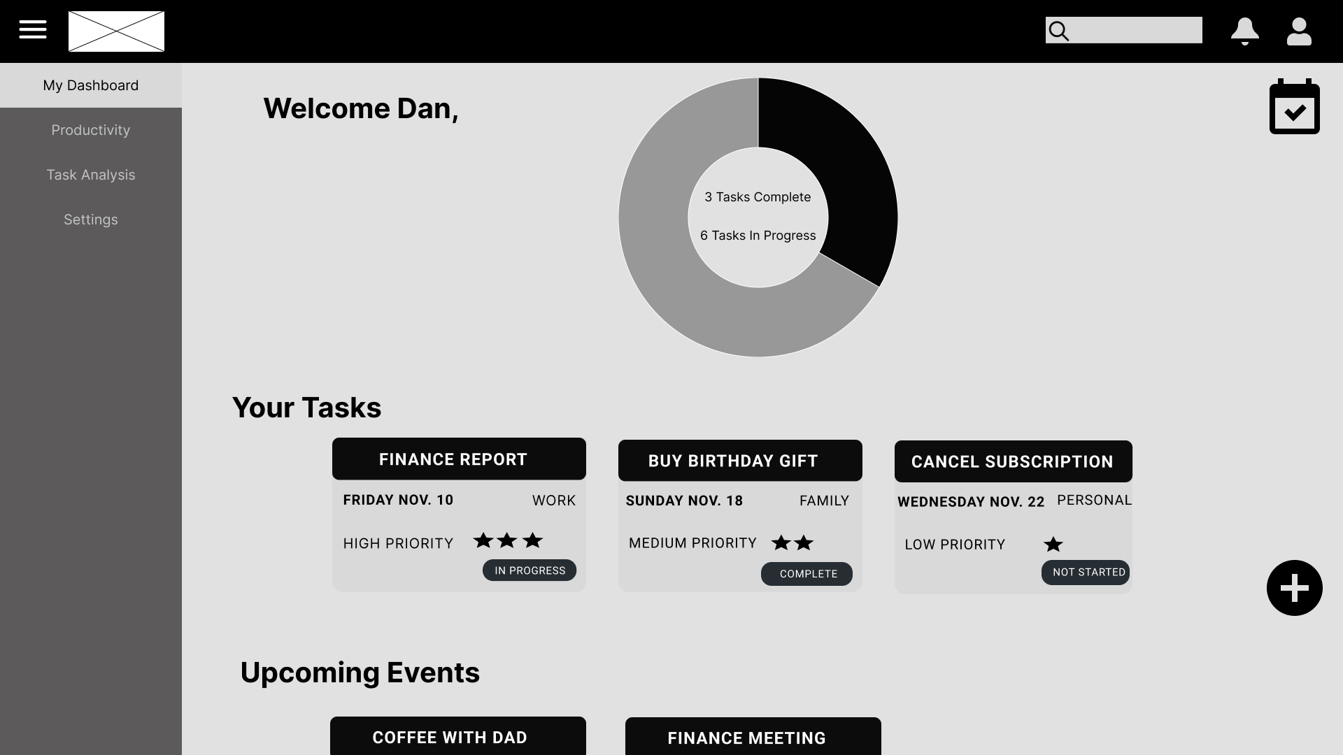
Stage 2: Wireframe
For the wireframe, we focused on redesigning the layout and interaction flow based on the usability heuristics
We used the wireframe created in usability testing to collect more data that can help us identify more problems
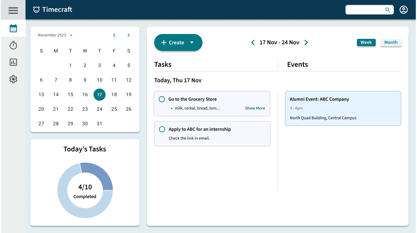
Stage 3: High Fidelity Prototype
The final prototyped design took aesthetics into consideration
We also adopted an expandable side bar in the final design to create more space for main contents
My Schedule
Usability Testing Results
There is no clear distinction between past events and upcoming events
"I'm not sure if the event is in the future"- Participant 7
Tasks are not ordered by due dates
"There is no due date for tasks, I prefer to have things ordered by deadlines" - Participant 8
The lack of colors resulted in confusion for many users
“I didn’t realize the task is added. I was looking at the event column maybe because the dark color made it more obvious" - Participant 7
" I think you can add some color coding for the prototype" - Participant 3
Changes made
Past events and upcoming events
Used different colors on the text and card background for past and upcoming events.
Tasks are listed under their corresponding due date arranged tasks by deadlines.
Added colors for the hi-fi prototype.
Used color coding to make sure users can easily see the difference between tasks and events.
Reflections
Following the process of iterative design cycles led to a refined and optimized result.
The importance of usability tests was clearly visible as observing participants use the prototype helped us to identify the strengths and weaknesses of our product.
Building the information architecture and user flows of the product helped us understand which features would work with the overall user experience and which ones needed to be modified.


